In this week’s blogpost, I will talk about my next favorite chart pattern which is also among one of the simplest patterns to identify – the Rectangle Pattern. If you are wondering which chart pattern is my favorite, I have covered it in this blogpost.
The rectangle pattern can be both a continuation pattern or a reversal pattern.
How to spot a rectangle pattern?
All you need to check is whether a price has reversed multiple times from the same level after a move up and after a move down. It can be imagined as a box with an upper boundary and lower boundary and the price should have reversed at least twice from the upper boundary and the lower boundary.
Below is an example of #Aartidrugs in which you can see how it was trading between 100 and 200 for 5 years to form a perfect rectangle pattern. Observe how the price went to 200 and reversed 3 times between 2015 and 2020. Also the price reversed 3 times after it reached 100 levels . The 3rd point of reversal was also at a trendline support and that was a confluence of support zones which meant the chances of price reversing strongly was very high.
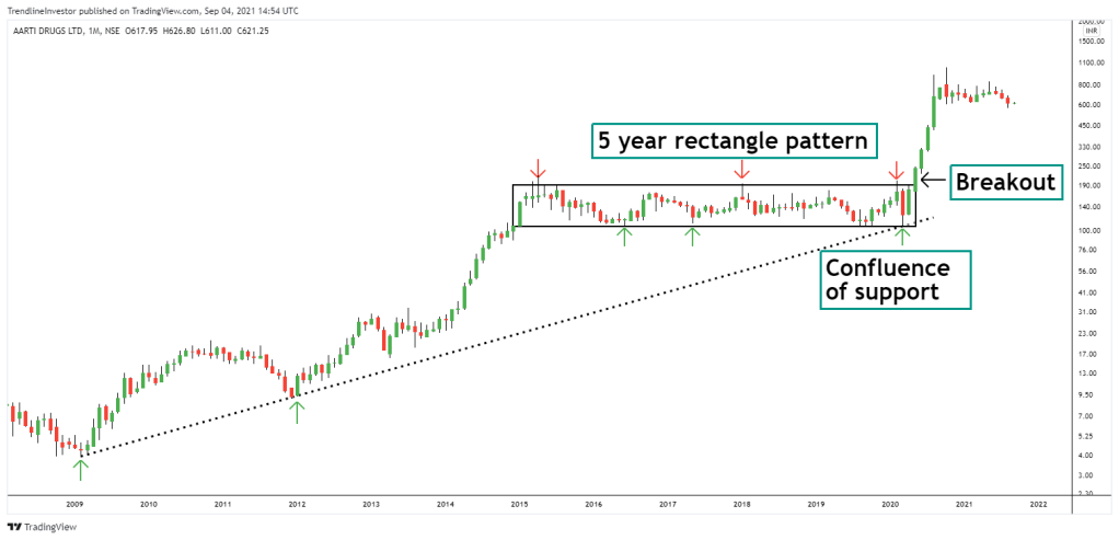
After the strong 5 year consolidation, in May’20 the stock broke out of this rectangle pattern and crossed 200 levels which was the upper boundary. Since then, the stock moved one way up and is currently trading at 620 levels and has been consolidating.
How should you trade the rectangle pattern?
In order to trade this pattern, you should:
- Identify if the price reversed at least two times from the upper boundary and the lower boundary. Without this, the pattern would not exist.
- Buy the stock once it crosses the upper boundary. You can place a buy-stop order and when the price crosses the upper boundary the order would be triggered.
- Keep a stop loss below the previous swing low.
Remember the longer the consolidation, the larger the price moves.
Let’s take a few more examples of this pattern
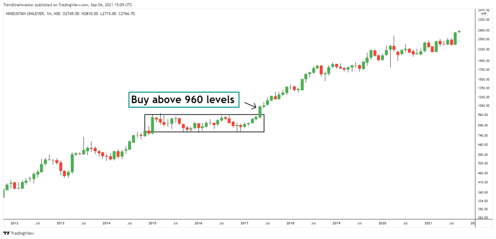
Example 1: Hindustan Unilever
Below is an example of Hindustan Unilever monthly chart. The price went sideways between 860 and 960 from Jan’15 to Apr’17. In May’17 the stock gave a strong breakout and the stock has been in a strong uptrend since then and is trading currently at 2750+ levels.
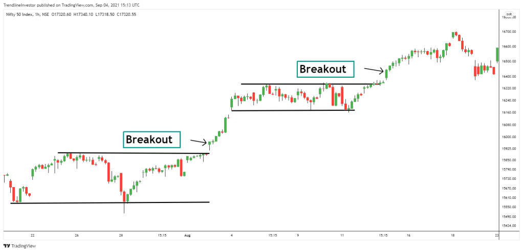
Example 2: Nifty
Below is another example of rectangle pattern in the Nifty hourly chart. After the strong price consolidation in a rectangle pattern, Nifty broke out with a gap up and moved higher quickly.
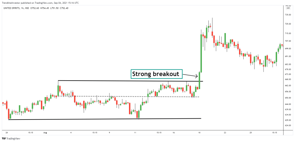
Example 3: United Spirits
Below is another example of United spirits hourly charts where a strong rally followed after a strong rectangle pattern consolidation.
I hope this explanation has been useful and you will be able to find and trade the rectangle chart pattern successfully.
If you liked my blog, you can support me by buying me a coffee!
