Many people have been asking me how to find stocks that will outperform the markets. So today, I thought of answering this question.
Defining Outperformance
We say that a stock is outperforming the market when:
- Nifty is going up, but the stock is going up much faster than Nifty
- Nifty is going down, but the stock is going down much slower than Nifty or going up
Defining Underperformance
We say that a stock is underperforming the market when:
- Nifty is going down, but the stock is going down much faster than Nifty
- Nifty is going up, but the stock is going up lesser than Nifty or going down
How to Identify stocks that can generate higher returns than a benchmark?
The answer is simple- you want to look for stocks that are ‘moving faster than the benchmark’. In our case, this benchmark is Nifty. You may ask how do you define ‘moving faster than the benchmark’. Let me explain this.
If you are walking at 4 kmph and if there is a car moving at 40 kmph, it is very obvious that the car is moving much faster than you. So, in order to explain it to someone in a mathematical way, you can say that the car was 10 times faster than you i.e. 40 kmph/4 kmph = 10 times. This is how you express the relative speed of the car in comparison to your own speed.
Now let’s compare the car with an aeroplane. If the aeroplane was flying at a speed of 400 kmph, then you can say in relative terms that the aeroplane was 10 times faster than the car.
Summarising, the Aeroplane was 10 times faster than the car and the car was 10 times faster than you. Simple? Now, let’s extend this concept to markets.
Let’s apply the same logic to markets
If a stock has gone up from 100 to 500 in the last 6 months and Nifty has gone up from 10000 to 15000 in the last 6 months, then you can say the stock has gone up 5 times and Nifty has gone up only 50%.
Now, let’s say you plot this using a mathematical way. When the stock was at 100, Nifty was at 10000. Now you divide the stock price by the Nifty price. So, you get 100/10000 which is equal to 0.01. To make it easily understandable, let’s multiply this by 100. So, 0.01*100=1. So, this is what we did.
(Stock Price/Nifty Price) * 100 = (100/10000)*100 = 1
If you continue to do this every day until the stock reaches 500 and Nifty reaches 15000 and if you plot it in a graph with the ratio on the y-axis and time on the x-axis, you will notice a rising line/graph chart- as shown below where the chart is trending up.
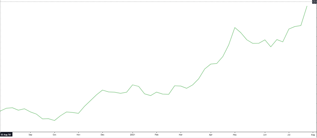
So, what does this chart tell you? It tells you that the stock is moving faster than Nifty and as a result the stock gains are much higher than Nifty gains for the given time period.
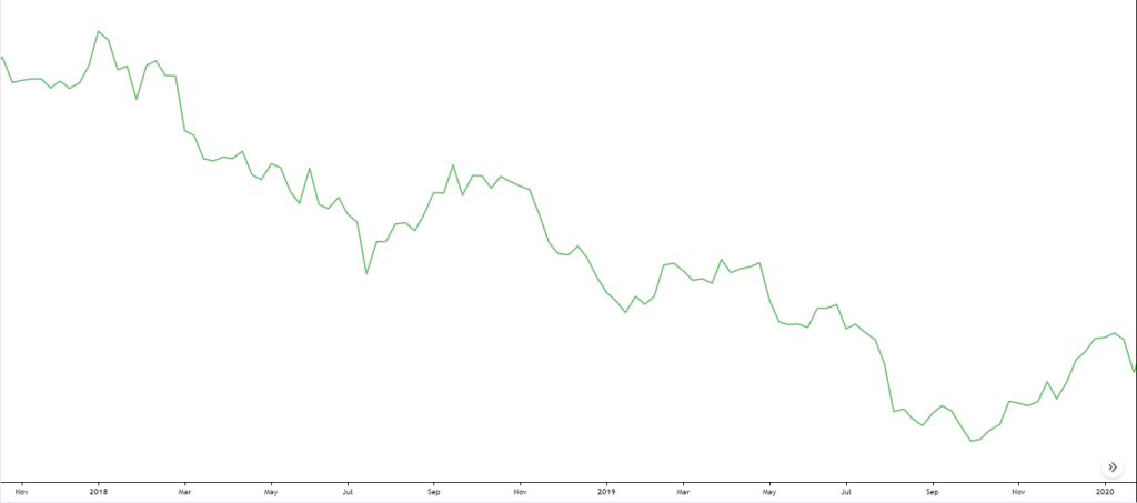
The reverse can also happen. If the stock is not going up as much as Nifty, then you will see a line/graph chart where the trend is down, as shown below.
I think you understand now that you should always be holding a stock where the ratio of the Stock to Nifty or the Relative strength(RS) is trending up and not down.
Adding a moving average to the Relative strength
The above charts are just ratios and there might be intermediate spikes on both sides – up and down. Now in order to smoothen this chart I am going to plot a 52 week exponential moving average that will help us understand the average of the last 1 year.
In the below chart you will see that the red line which is the moving average of the relative strength is much smoother and shows you that the relative strength was in a strong downtrend and then started to move higher.

So, if the relative strength is above the moving average, this signals that the relative strength is moving higher or the stock is outperforming Nifty.
If the relative strength is below the moving average, this signals that the relative strength is moving lower or the stock is underperforming Nifty.
Tatasteel Example
Let’s combine this relative strength with a price chart and observe the trend changes.
In the below chart you will see, around Line 1, how the price remained flat but the RS kept rising indicating strong outperformance by TataSteel.
Later the stock price also broke out from consolidation and started a long term uptrend that lasted for 2 long years from 2016 to 2018.

In 2018 after a 2 year strong uptrend (Line 2), the RS went below the red line and the stock price also broke down from an uptrend and started heading lower. Since, 2018 observe the RS line has always stayed well below the red line indicating strong underperformance and also the price kept heading lower.
Just around the Covid crash (Line 3), notice how the RS line stayed flat while the Tatasteel share price broke the previous low of 320 and went down towards 250. RS remained flat because Tatasteel price fell much lesser than Nifty. Later around Nov’20 the stock price broke out from the downtrend and headed higher while the RS also went above the red line. Since that breakout in Nov’20 Tatasteel has outperformed Nifty by a mile.
Always ensure that the stock price has broken out even if RS is above red line.
So, now you know you should be holding stocks that are outperforming markets.
Note: Trendline can also be used on RS charts in the same way we use it in Nifty charts.
I hope you understand the importance of Relative strength from this article. If you have questions, do let me know in the comments section.
RS code for Tradingview
Relative Strength customer Indicator code for Trading view:
study(“Relative Strength Comparison”, shorttitle=”Relative Strength Comparison”)
a = tickerid
b = input(“Nifty”, type=symbol)
as = security(a, period, close)
bs = security(b, period, close)
plot((as/bs)100, title=”Relative Strength Comparison”, color=blue) len = input(52) len1 = input(10) plot(ema((as/bs)100, len), color=red)
plot(ema((as/bs)*100, len1), color=green)
If you liked my blog, you can support me by buying me a coffee!

Hello like your RS strategy and need your help to understand the 52-week moving average line.
And one more thing I am not able to plot relative strength on trading view.
If you can guide me it will be a great help.
Awaiting your reply.
LikeLike
Hi Nirav,
Please use this code. Please DM on twitter to get your questions answered.
If it still does not work, search for “RS Line” indicator in tradingview by JohnMuchow and use that
study(“Relative Strength Comparison”, shorttitle=”Relative Strength Comparison”)
a = tickerid
b = input(“Nifty”, type=symbol)
as = security(a, period, close)
bs = security(b, period, close)
plot((as/bs)*100, title=”Relative Strength Comparison”, color=blue)
len = input(52)
len1 = input(10)
plot(ema((as/bs)*100, len), color=red)
plot(ema((as/bs)*100, len1), color=green)
LikeLike
Sir, Script is not plotting on the chart as shown above in the image. Its creating a section below in the chart. Plz share your indicator link.
LikeLike
Wonderful Blog by the way. Unique insights on working with trend and strength of any stock. Thank you!
And also appreciate you for putting together the code for trading view. But I tried to add the code inTrading View but it gives and error “Script could not be translated from: null”.
Is there any issue with the code? Or am I doing something wrong?
LikeLike
Hi Shreedhar, Thanks for the feedback. Please use this code.
If it still does not work, search for “RS Line” indicator in tradingview by JohnMuchow and use that
study(“Relative Strength Comparison”, shorttitle=”Relative Strength Comparison”)
a = tickerid
b = input(“Nifty”, type=symbol)
as = security(a, period, close)
bs = security(b, period, close)
plot((as/bs)*100, title=”Relative Strength Comparison”, color=blue)
len = input(52)
len1 = input(10)
plot(ema((as/bs)*100, len), color=red)
plot(ema((as/bs)*100, len1), color=green)
LikeLike
Hi, tried the code in TradingView. Gives error in this line “plot((as/bs)100, title=”Relative Strength Comparison”, color=blue) len = input(52) len1 = input(10) plot(ema((as/bs)100, len), color=red)
plot(ema((as/bs)*100, len1), color=green)”
LikeLike
Hi, use the below code.
If it still does not work, search for “RS Line” indicator in tradingview by JohnMuchow and use that
study(“Relative Strength Comparison”, shorttitle=”Relative Strength Comparison”)
a = tickerid
b = input(“Nifty”, type=symbol)
as = security(a, period, close)
bs = security(b, period, close)
plot((as/bs)*100, title=”Relative Strength Comparison”, color=blue)
len = input(52)
len1 = input(10)
plot(ema((as/bs)*100, len), color=red)
plot(ema((as/bs)*100, len1), color=green)
LikeLike
The error is due to directly copying and pasting in the pine editor. You can remove the quotation marks used everywhere and re-enter in the pine editor. Actually it is syntax error due to wrong character present in the code.
LikeLiked by 1 person
Hi, Shreedhar….
Can you post screenshot of pine editor of this indicator (directly from Tradingview).
Still failed to get indicator
LikeLike
Hi Shreedhar, thank you for sharing your view and the indicator.
I too think RS can be a very valid tool in stock selection and would be a great help if you could build the indicator on the tradingview and share as unfortunately it’s not copying right.
LikeLike