One of the most frequent questions asked is: “When should I use Log vs Linear scale in Charting?” and “What does it mean?”.
This is the most important thing when it comes to charting and if you don’t use the right scale then you might not really understand what’s happening in the price and you might tend to take incorrect decisions that might affect your investing/trading decisions.
When you plot a price chart you have two options as to how you want the price axis or the y-axis to be displayed.
- Linear Scale
- Log Scale
But, what’s the difference?
Understanding the Linear Scale
In the Linear scale, the y-axis is equally spaced. For example, if the lowest price point of Infosys was 0 and highest price point was 1500, then the charting software would try to equally space the y-axis with a difference of 100 points and the y-axis would read as 0,100,200,300,… 1200,1300,1400,1500 – that’s how the linear scale works. Now, you can switch to trading view and observe this or just check the linear scale of the Infosys chart below!

Understanding the Log Scale
In the Log scale, the price is plotted differently.
In the markets, numerous stocks trade over many years and they usually tend to rise over the long term. This means that the difference between the lowest price of the stock and the highest price would be large. In the case of Infosys, the lowest price was Rs.0.70 in 1996 and is currently trading at Rs. 1555. Do you see the price difference? 1555 is much larger than 0.70.
So, when you plot the price on the linear scale you literally do not see the price movements when it was in single digits and you do not get an accurate price perspective as in the above linear scale chart of Infosys. You can also see that the stock price has increased significantly in the recent few months which is indicated by the big green candles. Given the recent run up in the stock, anyone looking at it in the linear scale, might be afraid to enter the stock. However, looking at the same chart in log scale might provide a different perspective.
In short, viewers of the linear chart don’t really get the price perspective when the price has moved significantly. This problem is solved by the log scale.
The log scale plots price in terms of percentage moves. For ex: the Y-axis would start with 0.5, 1, 2, 4, 8, 16, 32, 64, 128, 256, 512, 1024, 2048 and so on, which means that the price is allocated equally as a 100% move. So instead of plotting the absolute price movement, the chart plots the relative price movement comparing it to the previous moves thus giving the viewer a price perspective of the long-term price.
Below is the same Infosys chart on log scale. Observe the Y-axis and how the price is plotted. Though the difference between each value is not the same percentage, I hope this helps you understand the log chart.

When to use Linear vs Log scale?
When you are looking at long-term charts greater than 1-2 years, it is always better to switch to log charts. But why? Refer to the below Reliance chart on the Log Scale(Left) and Linear Scale(Right).
As you can see in the Log chart (Left side):
- There is no price exaggeration like that in the linear chart (Right side)
- Long term trends are very clear and easily identifiable
- Trendlines can be easily drawn

When you are looking at price moves greater than 50% even with charts less than a year, it is better to switch to log charts to understand the price movement for the same reasons as above to identify the trend and draw trendlines.
When you are looking at shorter term price charts like a few months, it is fine to use either of the scales and observe how the price behaves in both scales and then take a decision accordingly.
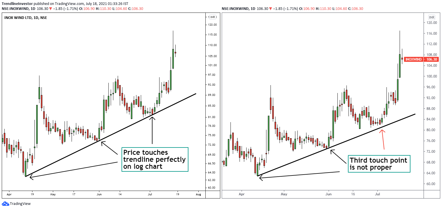
In the below Inox wind chart, you can observe how the price retests the trendline perfectly on the log scale(left) but not on the linear scale(right). This is because the price of Inox wind has moved a lot in the last 1 year and that affects the y-axis to some extent even on the shorter term charts.
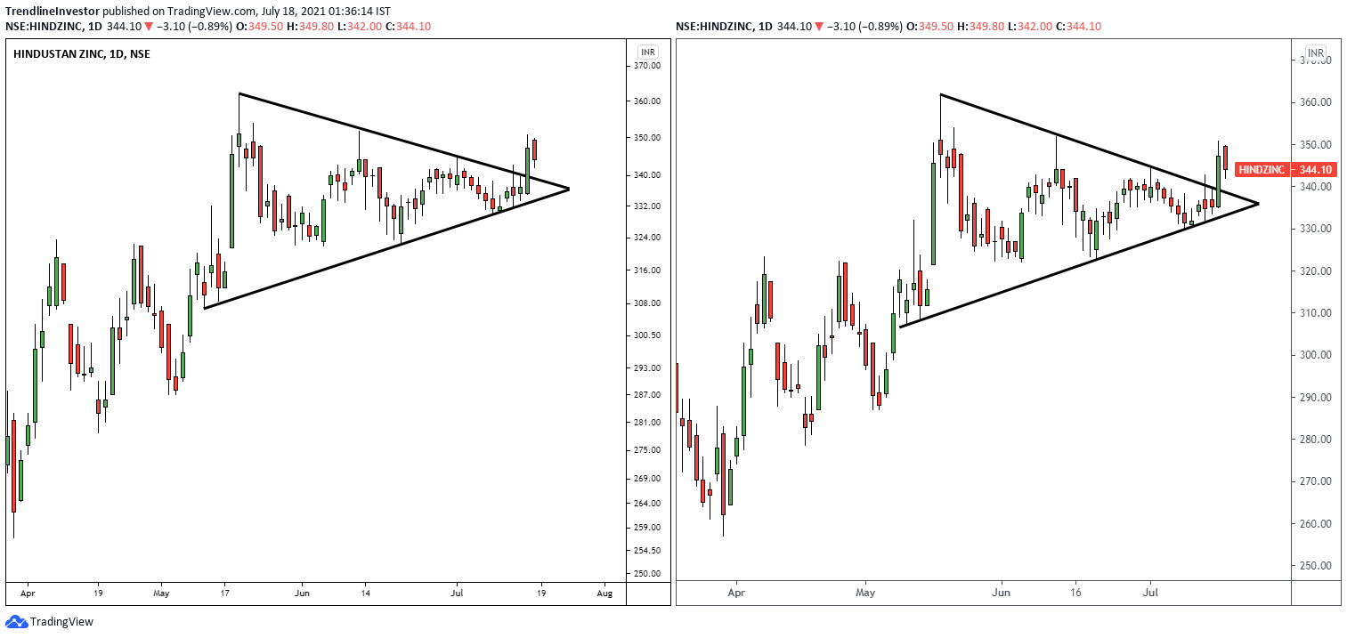
In the below chart of Hind Zinc, you can see how the trendlines work perfectly both on log and linear scale the same way. This is because the price has not shown a strong movement in the recent past.
So in short, if the price has moved a lot in the recent past it is always better to use the log chart. If the price has not moved much then both the log and linear scale will behave almost the same.
Key takeaway
If you are looking at long-term charts, switch to log scale immediately – there is no question about it.
So, are you ready to try the log scale and experience the new price perspective it will provide?
Let me know if you have any questions in the comments section.
If you liked my blog, you can support me by buying me a coffee!
